
 Form, function, aesthetics, program, these are concepts associated with architecture that are commonly misunderstood and generally discussed or considered as individual concepts rather than ingredients to a larger or more important whole. Despite not being a historian, I find it terribly frustrating that the notable phrase “form follows function” has been misused and misquoted; therefore, misunderstood for well over a century since Louis Sullivan coined the actual phrase “form ever follows function” in an essay he wrote in the late 1800’s. Without going deep into history and revealing my limitations, Mr. Sullivan was concerned over the Vitruvian development of form (firmitas, utilitas, venustas) as it related to or was a result of a building’s function rather than following pattern books of his era. In other words, there needs to be more to determining how architecture looks besides some opinion on what is “pretty” or by merely “decorating” a plain box. There are compositional aspects to what we do that can be judged as being subjective, dare I say personal, but there should be objective methods to design that can be understood and confirmed through the visual aspects.
In simple terms, when considering “form ever follows function, that is the law”, this concept intrinsically links these two components rather than resolving one first and if there’s opportunity, including the other. When we talk about how architecture works, we don’t just mean function.
 So, what does that look like? How does that manifest itself? How does (or how ought) an architect incorporate this type of thinking into their work? My goal is to create a new series sharing how I approach this in my work. Today we’ll start with a project from 2016 that is an interiors project for a graphic design/brand design agency in Pittsburgh. We love these guys – they are so creative and were the best to work with on this project.
 I was introduced to this project through a referral by a good friend (who is also a great architect). The tenant was not communicating clearly with their landlord regarding their desire for their renovated space, as they planned on moving to a different floor in the multi-story building where they had a lease for years. The architect who worked for the landlord either wasn’t that creative or wasn’t that motivated to depict a design that met their goals.
 This is where I came in. Short version – I met with the tenant, we talked, we sketched, we communicated well, they referred me to the landlord, we hit it off, I was commissioned to design the space, (technically working for the landlord now), and now this landlord is a great repeat client on several other properties of theirs. We use the same methodology in subsequent projects for them.
 We started with the tenant’s narrative, I kid you not, as creatives, they too understood the power of a story to describe the way they work and relate to their clients. This laid-back office does not have a receptionist, so it is important how a guest is greeted and led through the office, typically to a conference room for a presentation. Two conference rooms were needed and programmed at both ends of the building. Shielding the one and the journey to the other became a device to guide the layout of the space as well as the component to generate the formal elements of the space.

Guest enter the space and are given a visual cue to pause until greeted by a staff member. The angled shelf holds a vintage TV to capture their attention and serves as storage. The suspended ceiling panels indicate a point of pause.

Knowing the adjacent conference room would include a wall of glass (recycled from the demolition), we felt it important to shield that space from waiting snoopers which could distract those in a meeting. By studying various angles, we calculated a minor shift to the geometry would set the plane of the conference room (window) sufficiently out of sight until one walks (invited) deeper into the space. This 4-degree angle became a visual device that we used in other portions of the building to connect through memory to the entrance. Even the floor tile in the entrance matched this skewed axis to the dismay of the installer.
 The tenant relayed two methods they lead clients and guests into their space. The preferred “informal” route is a counter-clockwise journey past a small conference room, past open working rooms, through a lounge (to pick up a beverage of all varieties) to where they arrive in a large conference room. This allows opportunity for a staff member or a partner to talk to their client along the way and show off their creative ways of working pinned up around the office.

The second path, the formal path, is a direct, practical route straight ahead to the conference room, past the offices of the partners and the general staff work area. Even in this path, we were concerned about the view ahead and had originally planned a paneled wall where an overhead projector could play videos and slideshows of their work. It evolved into a wall of shifted plywood panels that terminated the view as one slides past it into the lounge and conference room.
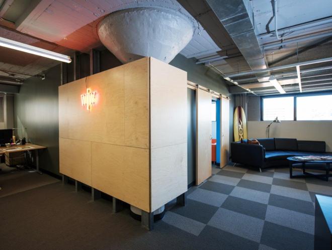
The lounge is more than a place to for staff to eat lunch, but is a series of casual work spaces, an eating area and entrance into the large conference room guarded by sliding doors. We started with developing a large ceiling element that was intended to be a visual datum to unify these multiple zones (along with the checkered carpet pattern). Budget talks with the landlord had us maintain the idea, but with alternate materials. Our canted suspended ceiling recalls the shift introduced upon entry, but tangles with degrees of porosity by using two different ceiling panels – plywood and expanded metal as well as most that are fully open. The grid loosely defines a zone, not as originally planned, but not eliminated by VE either.
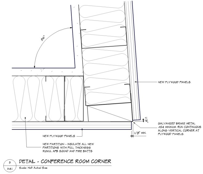
 The details are a continuation of these themes. Overhead plywood panels mark points of pause or change in direction. The matching wall panels at the entrance guide one’s eyes through the entrance and around the corner down the informal (preferred) path. The same suspended ceiling in the lounge is duplicated above the formal path. Since the budget stipulated an industrial, less refined assembly of elements, the landlord challenged me to develop the details to utilize construction methods that had to be done on site, without the benefits of a custom fabrication shop (i.e. hand tools). Therefore, we needed to avoid corners and joinery that would require high precision and finishing techniques only available in a cabinet shop. Exposed fasteners were specified, including the spacing to demonstrate a care for details, despite them being cruder in their overall thrust. Reveals separate material identity and permit easier on site finishing.


 Colors selected are saturated, but neutral to permit the tenant occasion to post their own work and not be upstaged by the office architecture. In two cases, a single wall in each conference room is painted a bold color that serves as a frame to the view beyond. The wall is primarily glass or a large opening that creates a ‘picture frame’ as one looks to the view beyond. It’s not intended as a focal point, but something to fill the peripheral vision.


We enjoyed this project as it exhibits the way we typically work to search for a formal response to a client’s program. Style is fleeting, but individual client tastes can be addressed if rooted in something deeper than decoration. This is how we see form ever following function. This is how architecture works.

Photographs by Skysight Photography


Your design agency project avidly illustrates “form ever follows function, that is the law”, as the design concept “intrinsically links these two components rather than resolving one first and if there’s opportunity, including the other.” There are so many reasons for liking this project. Among them, “We started with the tenant’s narrative, I kid you not, as creatives, they too understood the power of a story to describe the way they work and relate to their clients.” Yes! I have found every client has a narrative, and it’s as important as understanding the site. Next, “Style is fleeting, but individual client tastes can be addressed if rooted in something deeper than decoration.” The “story” told through the spatial journey, indirect and direct, reflects the nature of this design agency, and it is as contextual in a sensual and spiritual way as any other “vernacular.” Also, “Since the budget stipulated an industrial, less refined assembly of elements, the landlord challenged me to develop the details to utilize construction methods that had to be done on site, without the benefits of a custom fabrication shop . . . we needed to avoid corners and joinery that would require high precision and finishing techniques only available in a cabinet shop.” The entire project looks like it was done in a cabinet shop! And demolished materials were even salvaged and reused. Kudos to you and the contractor.
And the result? The spaces abound with varied interests and degrees of privacy, and yet get unified through a warm and inviting environmental journey composed of well-crafted views and sensitive vistas, materiality, and lovely detailing—no, insane detailing. Here the word “wall” becomes a different kind of wall as do the other walls: transparent, playful, colorful, discreet, secure, interactive, and friendly. Consequently, behold a place of vibrancy where organizational culture thrives as it pursues graphics and branding solutions for their clients. Lee, I know you are not looking for praise and shared the project as an example of “form ever follows function,” but projects like this need to get celebrated. Thank you for sharing. Love this project!
Grateful for the kind words and assessment.